I own design for an e-commerce infrastructure platform—from design strategy and user research through to UI and code. I built our Ace Design System from scratch, lead design partnerships with enterprise clients, and shape the product roadmap alongside leadership. I also ship React and TypeScript code to production daily—design intent doesn’t survive handoffs; it survives ownership.
Inside the platform—three threads of the same design philosophy.
- Scope
- Complete enterprise design system, designed in two weeks and built in code
- Outcome
- Deployed across the entire commerce platform; team builds without a designer in the loop
The app I inherited had no point of view. Multiple component libraries running side by side. Hardcoded colors (#FFFFFF and #000000) and font sizes. No empty states, no spacing system, buttons that didn't do anything, and no visual language at all.
Ace started with a question Sam (CEO) and I kept circling: what does Endless actually look like? Nobody knows a brand better than the founder, so I spent the first month pulling that identity out of her: on whiteboards, in mood boards, on the floors of the warehouses we visited. What stayed with me was the material world of commerce: kraft cardboard, packaging tape, information-dense labels, poly bags, the warm browns of a stockroom. I wanted Ace to feel like that.
Brand, behavior, and the patterns Shadcn doesn't ship with
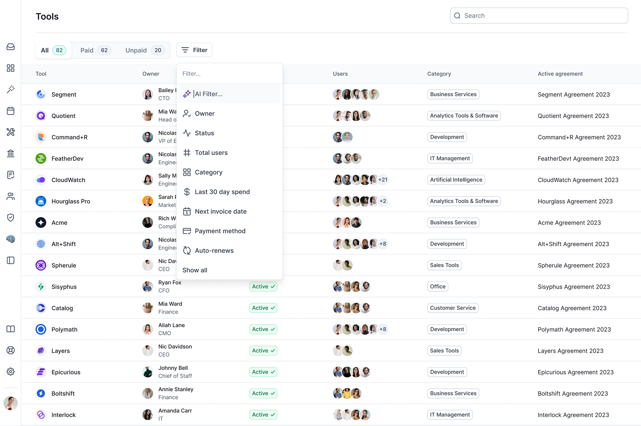
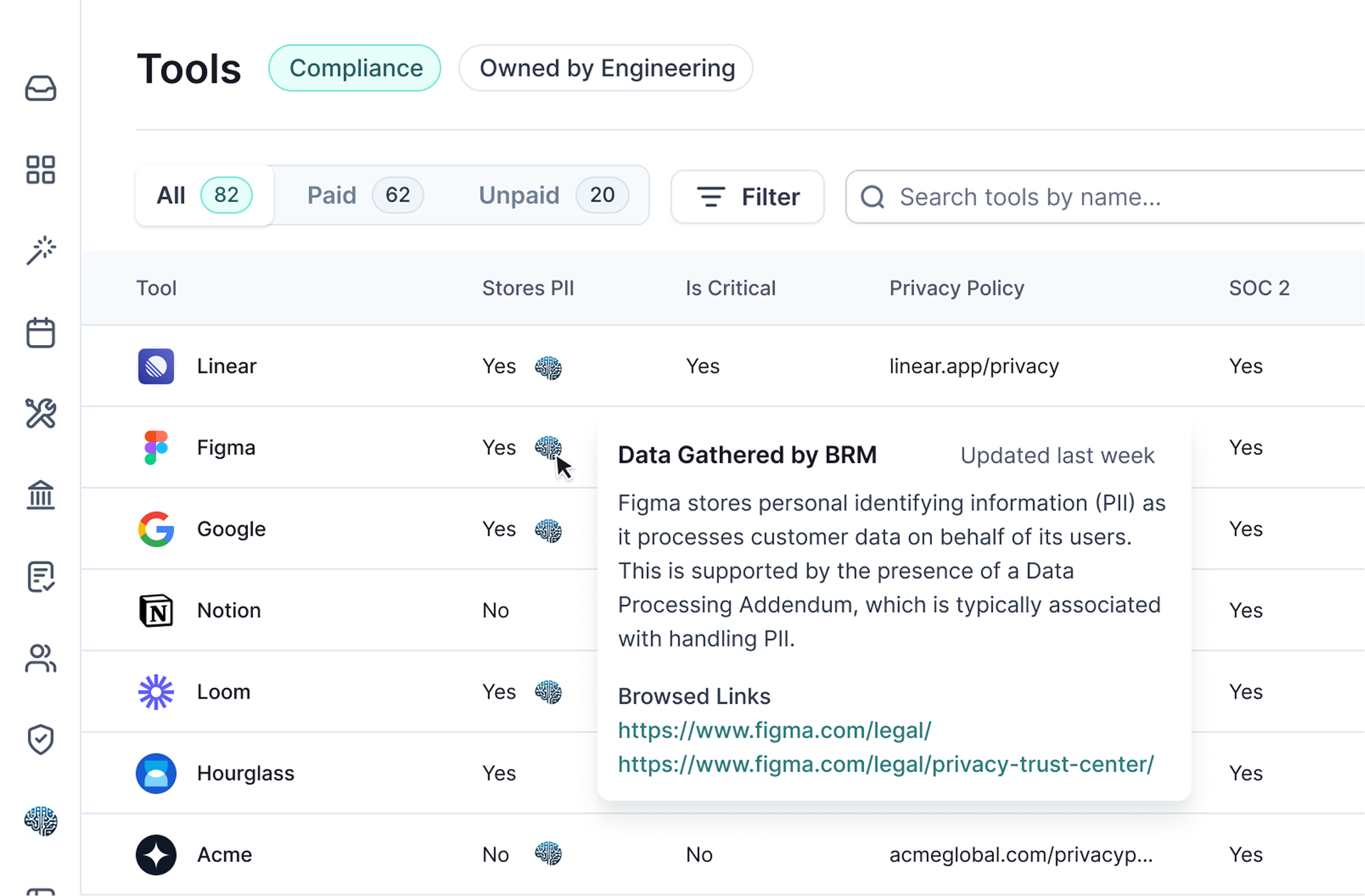
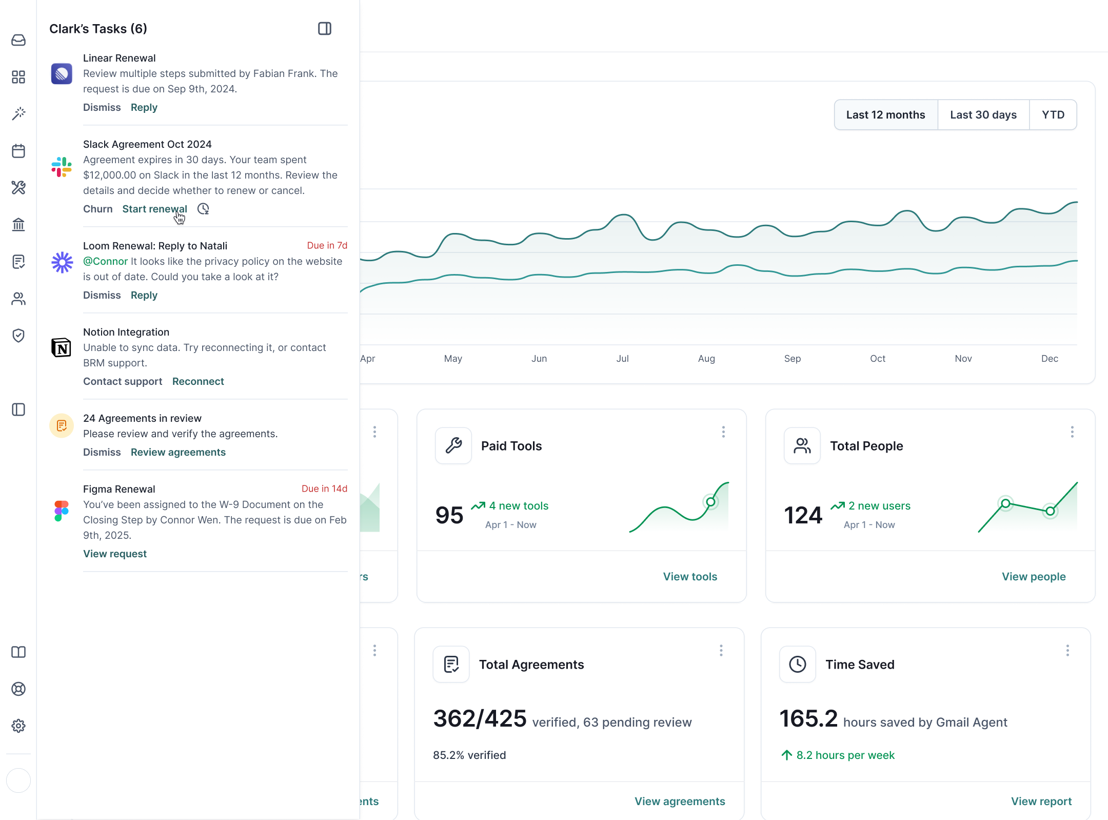
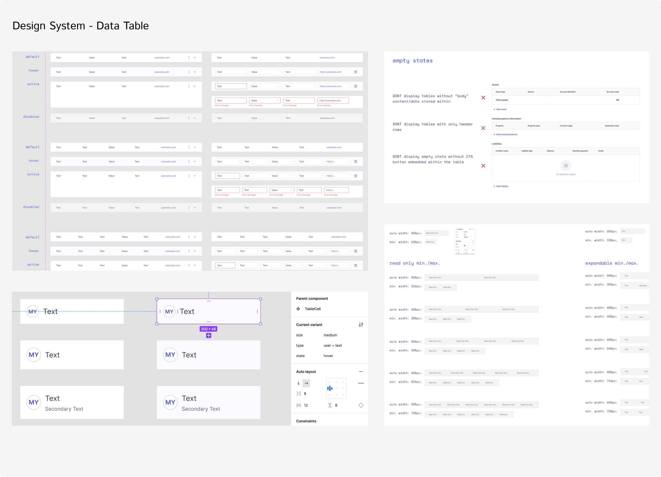
Shadcn handled the primitives so I didn't have to. It covers roughly 80% of what an enterprise app needs. That freed me to focus on what actually defines a product: brand language, interaction patterns, the small craft decisions that compound over hundreds of surfaces. A design system isn't a component library. It's a point of view, expressed consistently enough that the team builds without asking what something should look like.
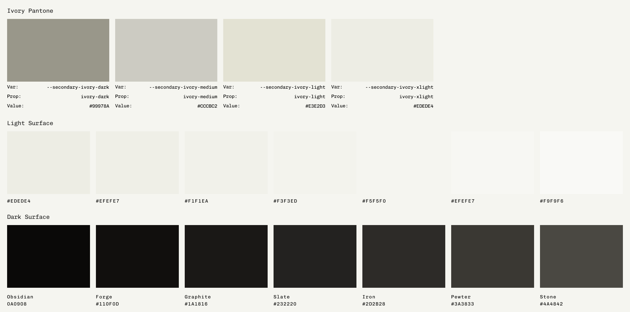
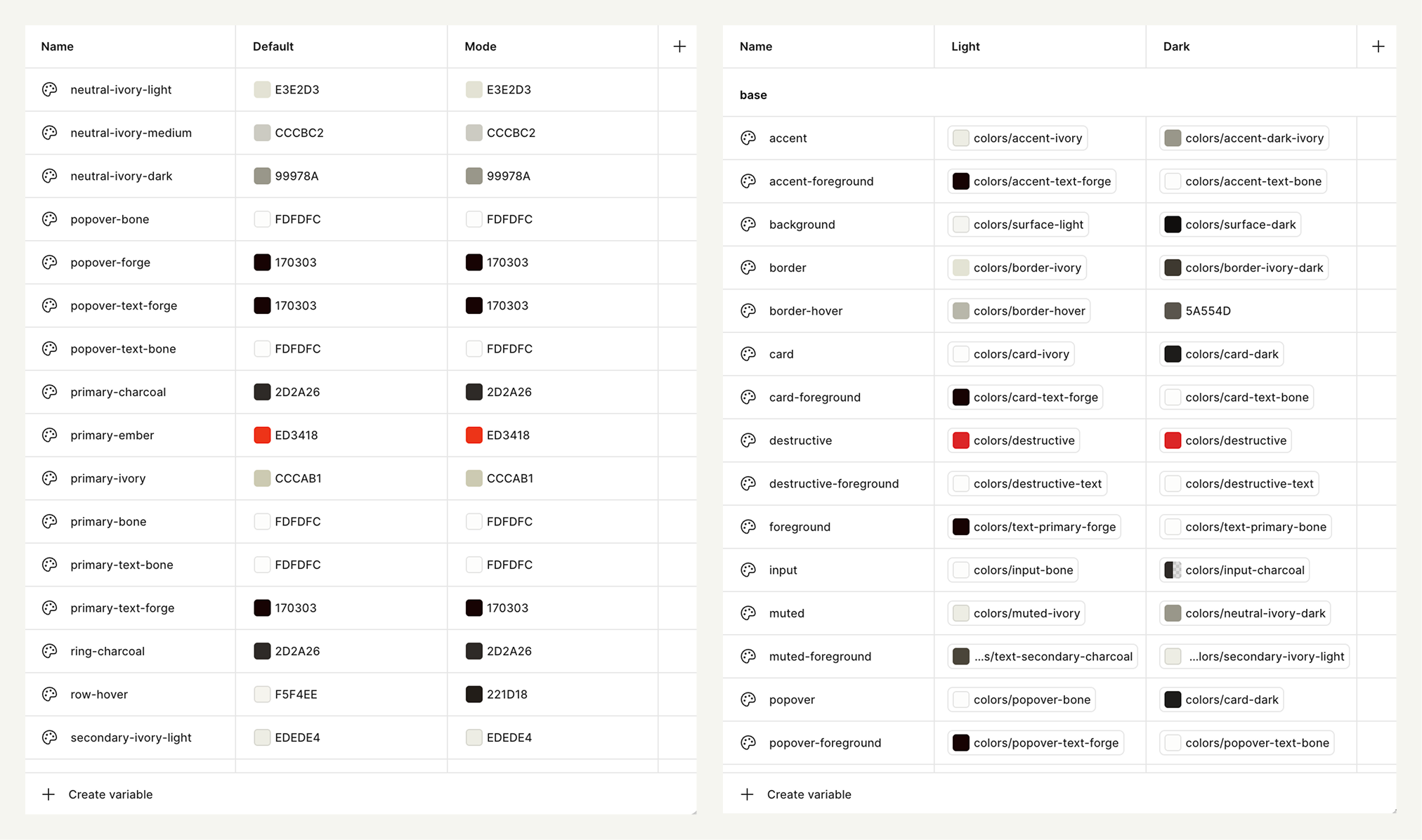
The color/variable work took the longest. Several shades of ivory tested in light and dark, the way a painter tests swatches. Ivory replaces pure white because pure white is harsh and doesn't exist in nature. Forge replaces black anywhere true black would read as a hole. Bone is reserved for primary buttons in dark mode, forge in light mode. Ember is the brand red, used sparingly as an accent.
Built for the people who live in the product
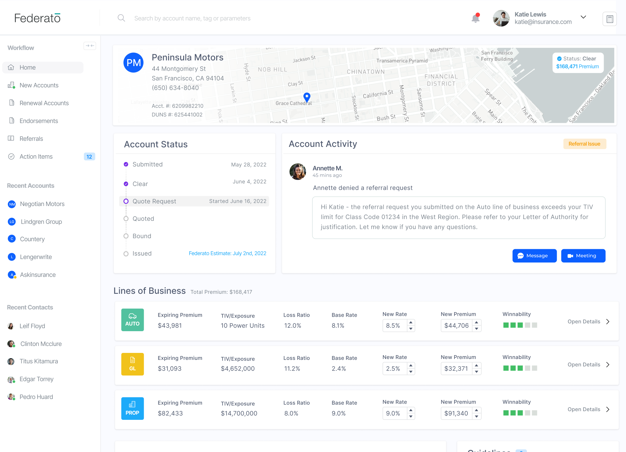
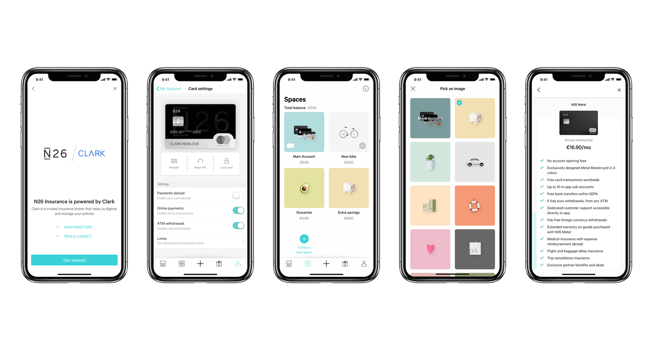
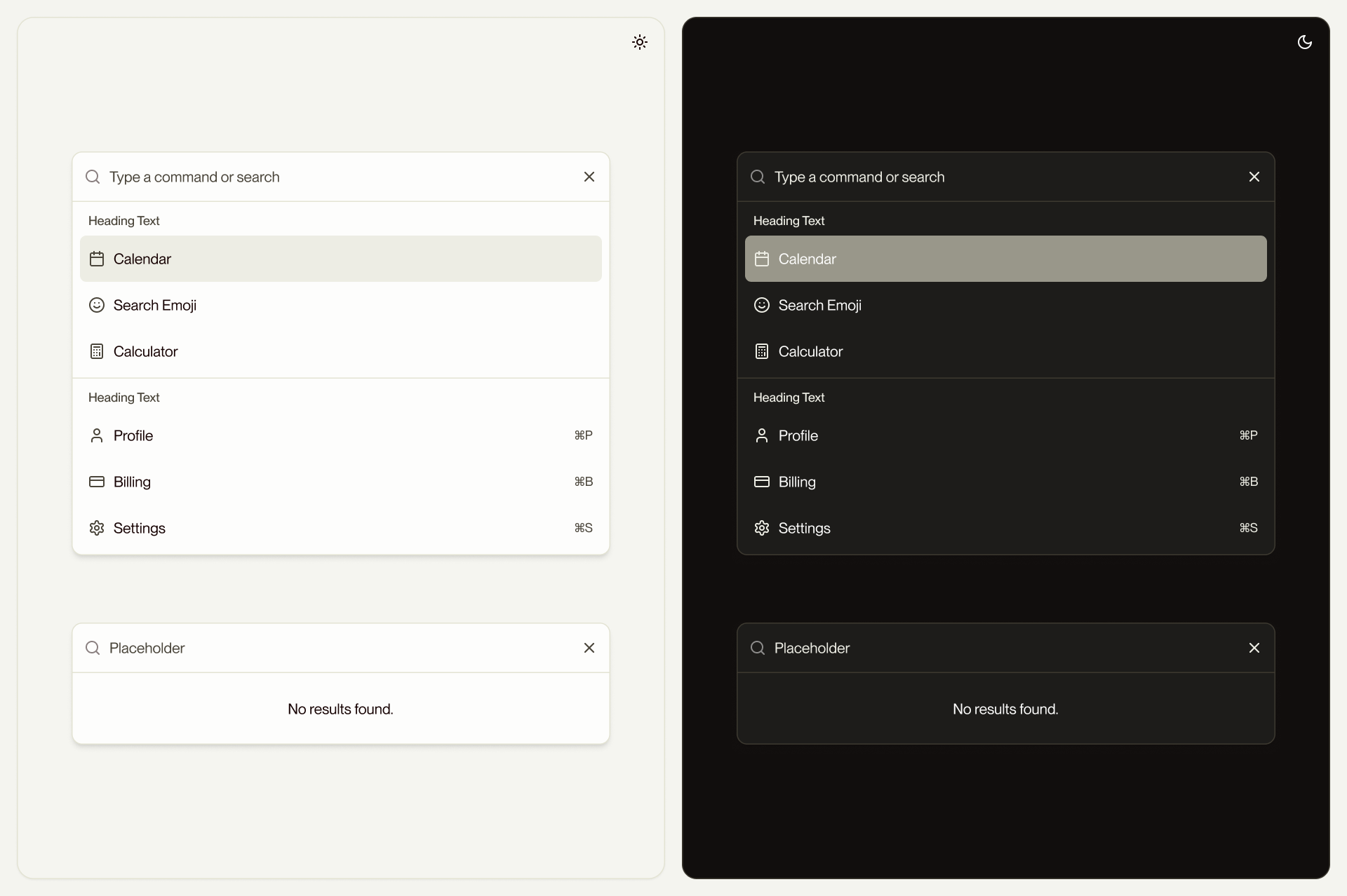
Most of Ace's strongest decisions were small interaction details that compound. The Quick View pattern existed in the app before I arrived, but it was inconsistent: different drawer sizes and behaviors, no keyboard handling, and slow loading times. I rebuilt it as a single component for consistent behavior, applied it everywhere, and added keyboard shortcuts so power users can step through inventory items, orders, and order details without leaving the list view.
I also wanted Ace to be full of small details that add delight and quietly improve usability. Filter pills that contain the same styled badges of the rows they're filtering, so the eye connects the query to the result. Icon buttons in toolbars instead of text-heavy ones, so density doesn't translate into noise. Hover states that are deliberate rather than decorative.
The static decisions are subtractions. No heavy card shadows. No gradients on buttons. No cursor pointers on anything other than external links; interactivity is communicated through hover states, not by lighting up the cursor everywhere the user moves. Only primary actions get filled buttons; secondary and tertiary use ghost treatments. The result feels like a powerful native app, not a consumer tool dressed up for the web.
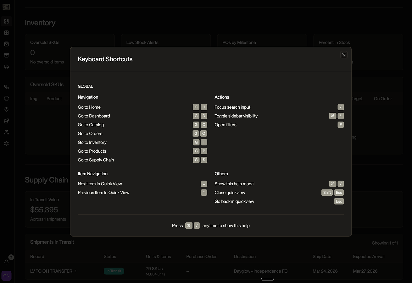
Keyboard navigation was built in from the start. Global navigation runs on G shortcuts: G+C for Catalog, G+I for Inventory, G+O for Orders, G+S for Supply Chain, with the full set documented in a ⌘ / help modal. Up and down arrows step between detail records inside Quick View. A command palette covers everything else. Esc steps back; Shift+Esc closes Quick View entirely.
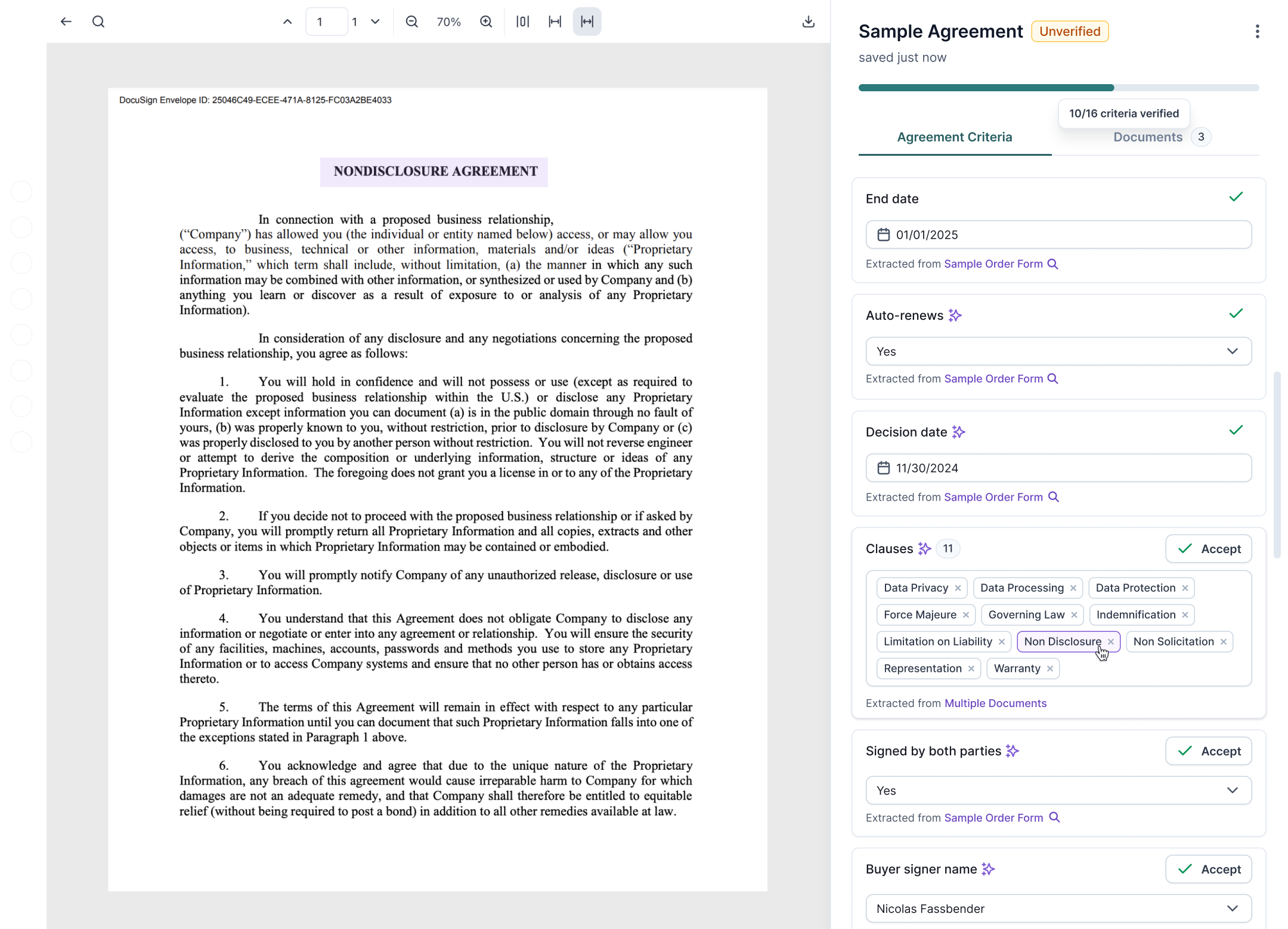
Every token defines both light and dark values at the moment of definition
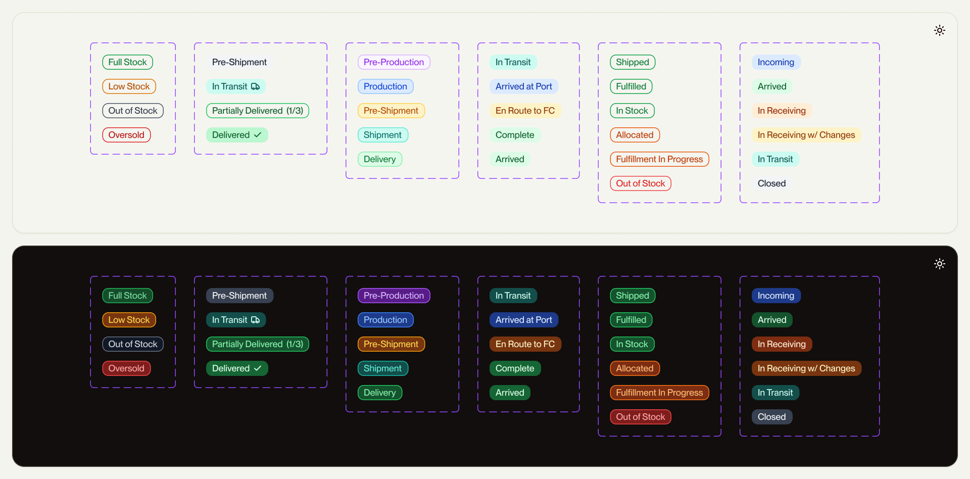
That doesn't mean dark mode was right immediately. It means there was always something to tune, never something to retrofit. The badge system was the work that proved this out: every status (Full Stock, Low Stock, In Production, Shipped, Delivered, Allocated, Fulfilling, Draft, Overdue, Oversold) across the platform has tested light and dark variants that hold their meaning across both surfaces.
The first pass shipped. Then I audited it in production, found some contrast issues where lighter color fills disappeared against Forge backgrounds, and refined the system. That cycle—define, ship, audit, refine—is the actual story of dark mode parity. Not a decision, a discipline.
Owning the code, not just the design
I designed Ace in two weeks and scoped the entire build in Linear, tickets organized by component, sorted into manageable cycles. Three months and two engineering handoffs later, the build was only half-completed. Token misuse, hardcoded values, components diverging from spec, etc.
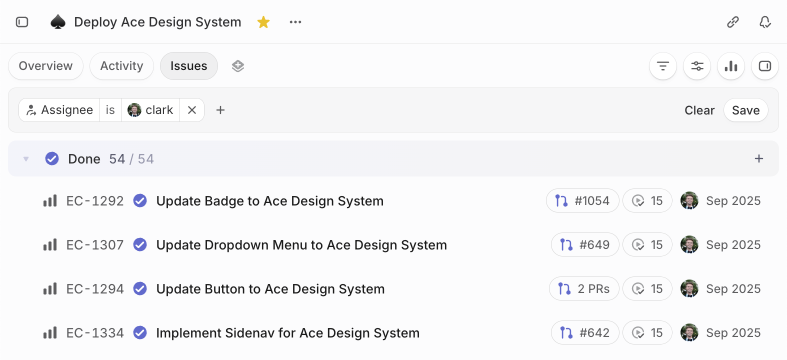
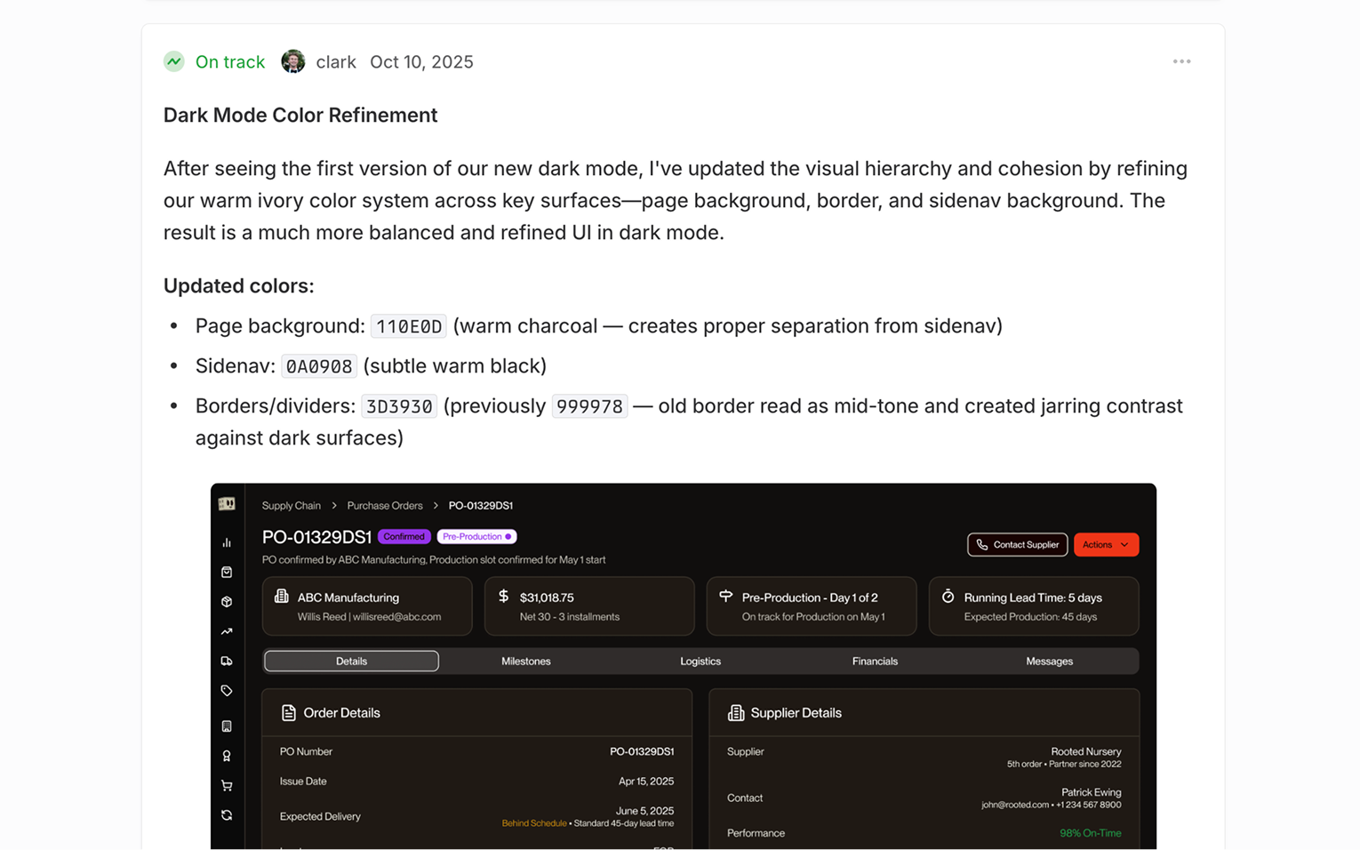
So I took it over. I finished the build in the codebase myself—shipping over 50 PRs in the span of 3 weeks—then kept refining: the dark mode color refinement that brought page background, sidenav, and borders into proper luminance hierarchy. Audits like that one don't happen at handoff—they happen when the designer owns the code.
Ace is live across the platform. The team builds with it without asking what something should look like. That's what a design system is for.
- Scope
- Designed and shipped the product catalog, end to end. Sheet view, grid view, product detail page, and the natural language editor that sits across it all.
- Outcome
- A best-in-class PIM operators trust as the system of record. Bulk edits land in seconds, not spreadsheets
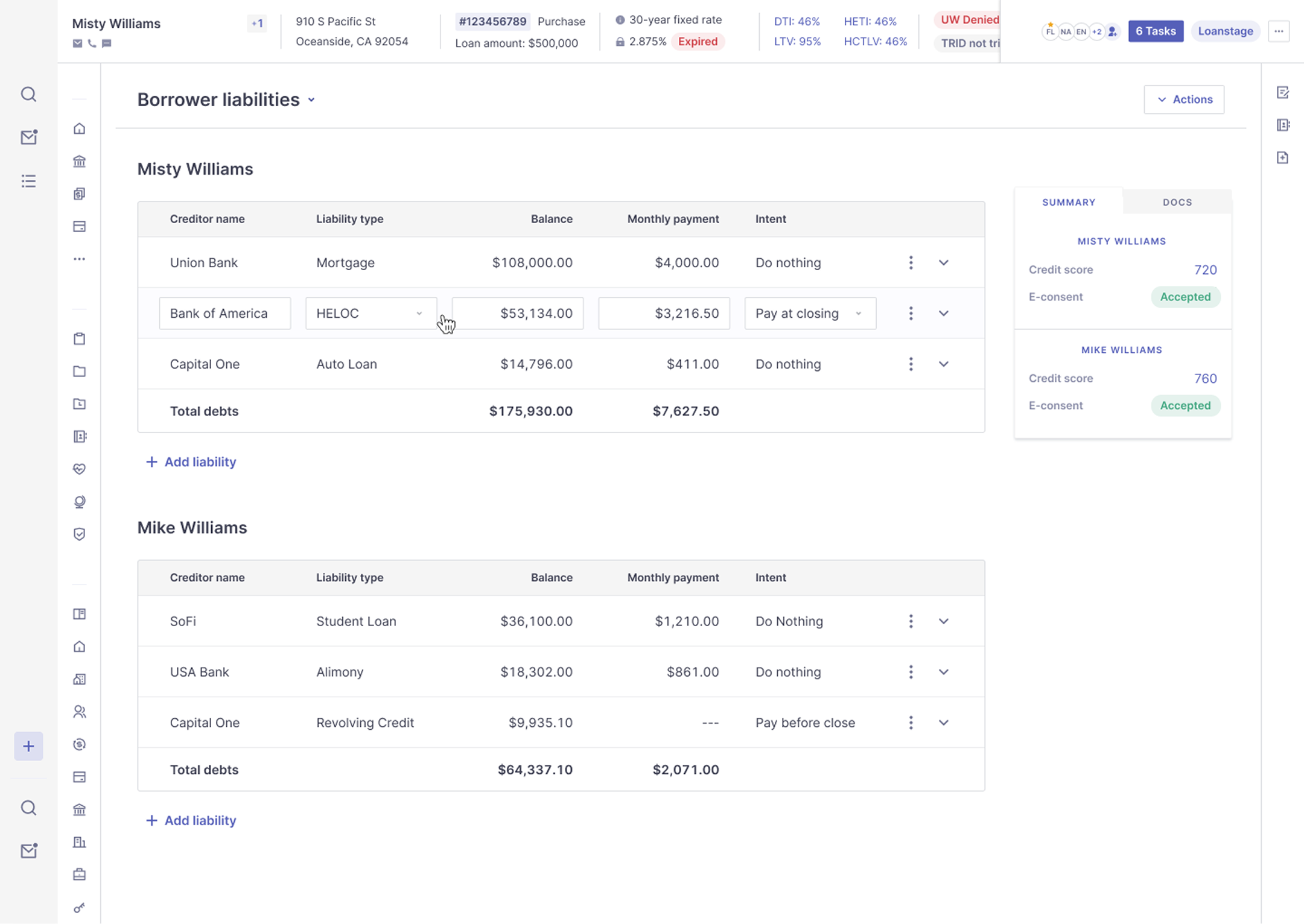
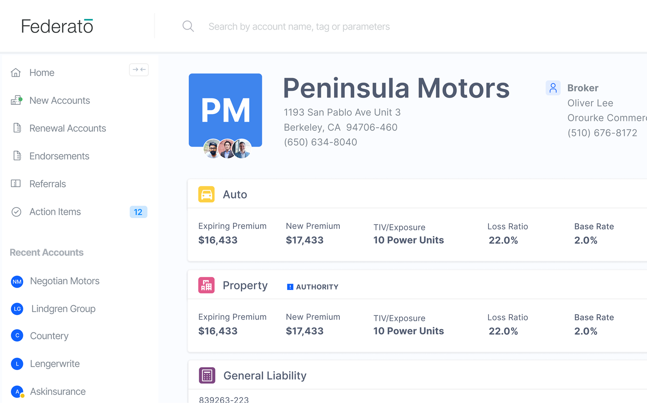
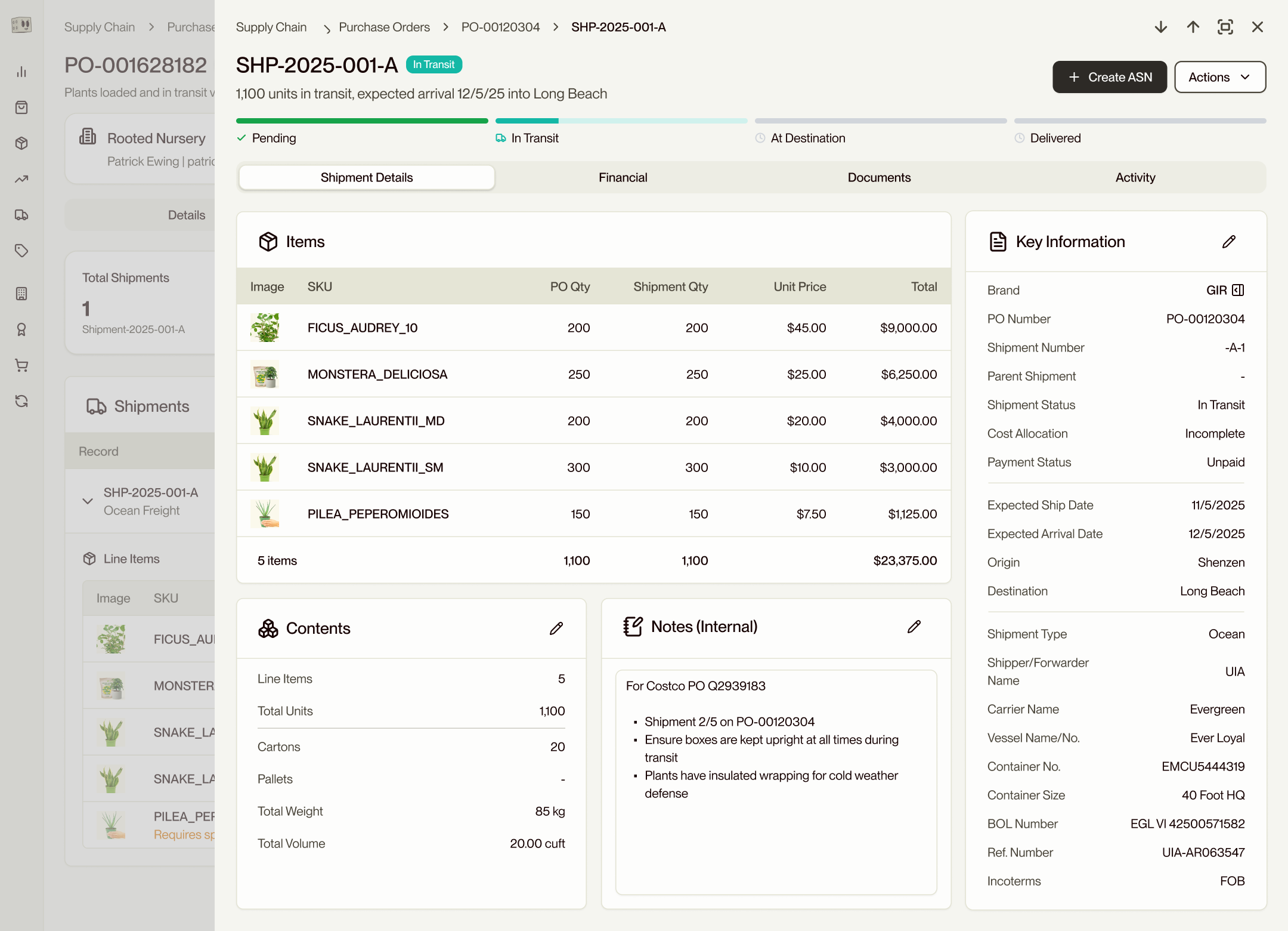
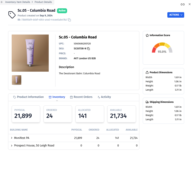
When I joined, the Product Detail Page had roughly a tenth of the data fields it carries today, a lackluster layout, and almost no editing experience. There was no bulk edit anywhere in the product. For a platform marketed as a PIM, that's a contradiction.
Operators rarely edit one product at a time. A Q4 catalog import lands and they're staring down 3,000 SKUs that all need a price update. Without bulk editing, the answer is export to CSV, edit in Excel, re-import. That's the spreadsheet tax, and it's why the original catalog couldn't function as a PIM.
The work was to fix both ends: make the single-record surface dense enough to be the source of truth, and build a bulk surface that operators would reach for first.
Two views for two ways of working
The catalog needed to scan two completely different ways. Some days an operator is working across the catalog: updating Q4 prices on 800 SKUs, retagging a seasonal collection, or fixing dimensional data on a vendor import. Other days they're working on a single product: prepping a launch, writing channel-specific copy, or reviewing an inbound shipment.
Working closely with Pete (Head of Product), I designed and shipped two views that share the same data but optimize for opposite workflows.
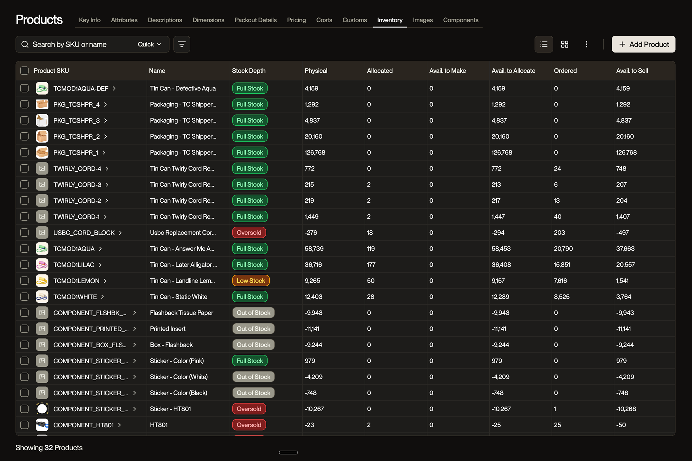
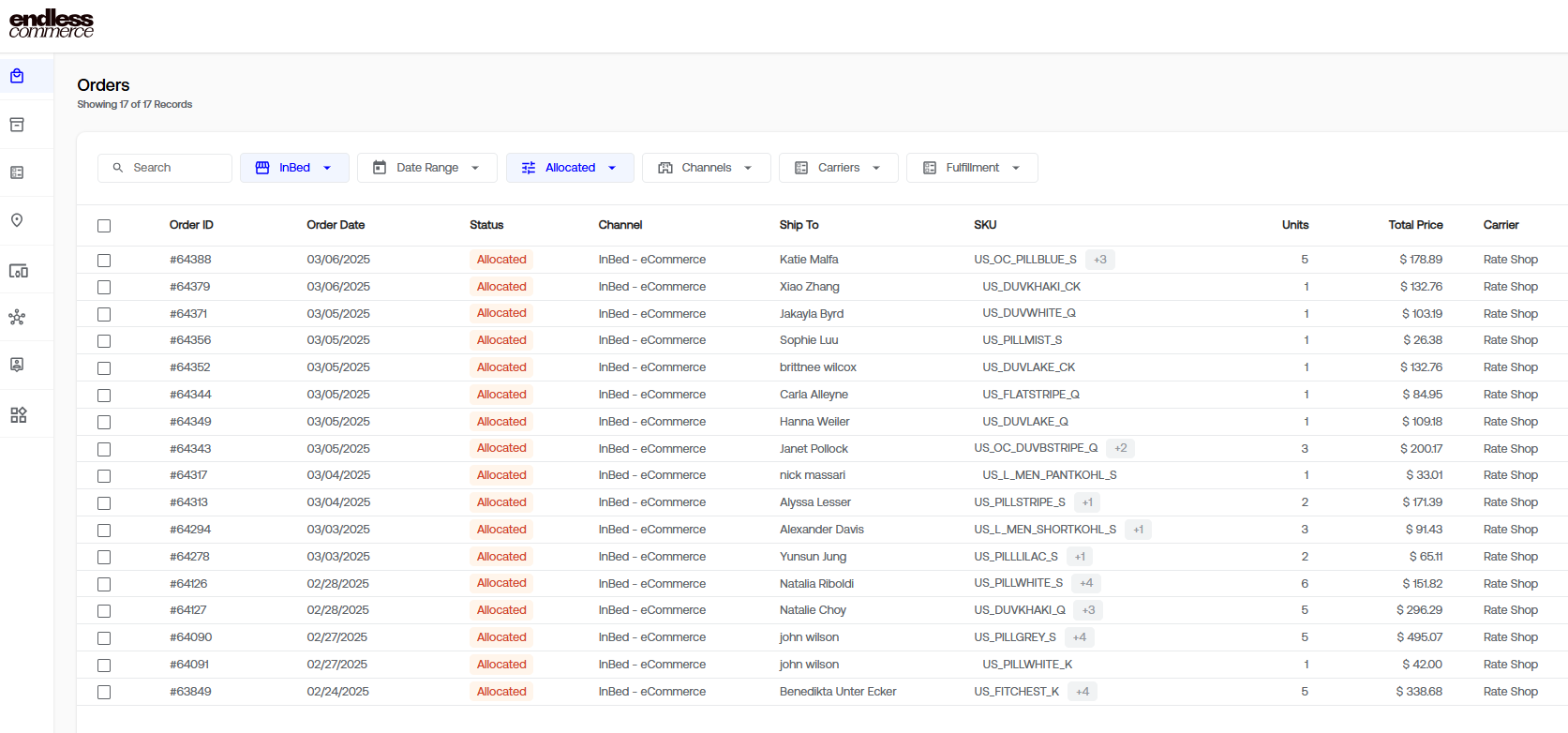
Sheet View is the bulk surface. Excel-style grid, single-click to edit, Tab and Enter navigation, multi-cell selection, paste from clipboard, ⌘Z undo, column resize and reorder. We dropped double-click in favor of single-click because double-click is a file-system convention and operators have spreadsheet muscle memory. We dropped the edit-mode toggle for the same reason: cells are always live, with a strong selected-cell state carrying the affordance.
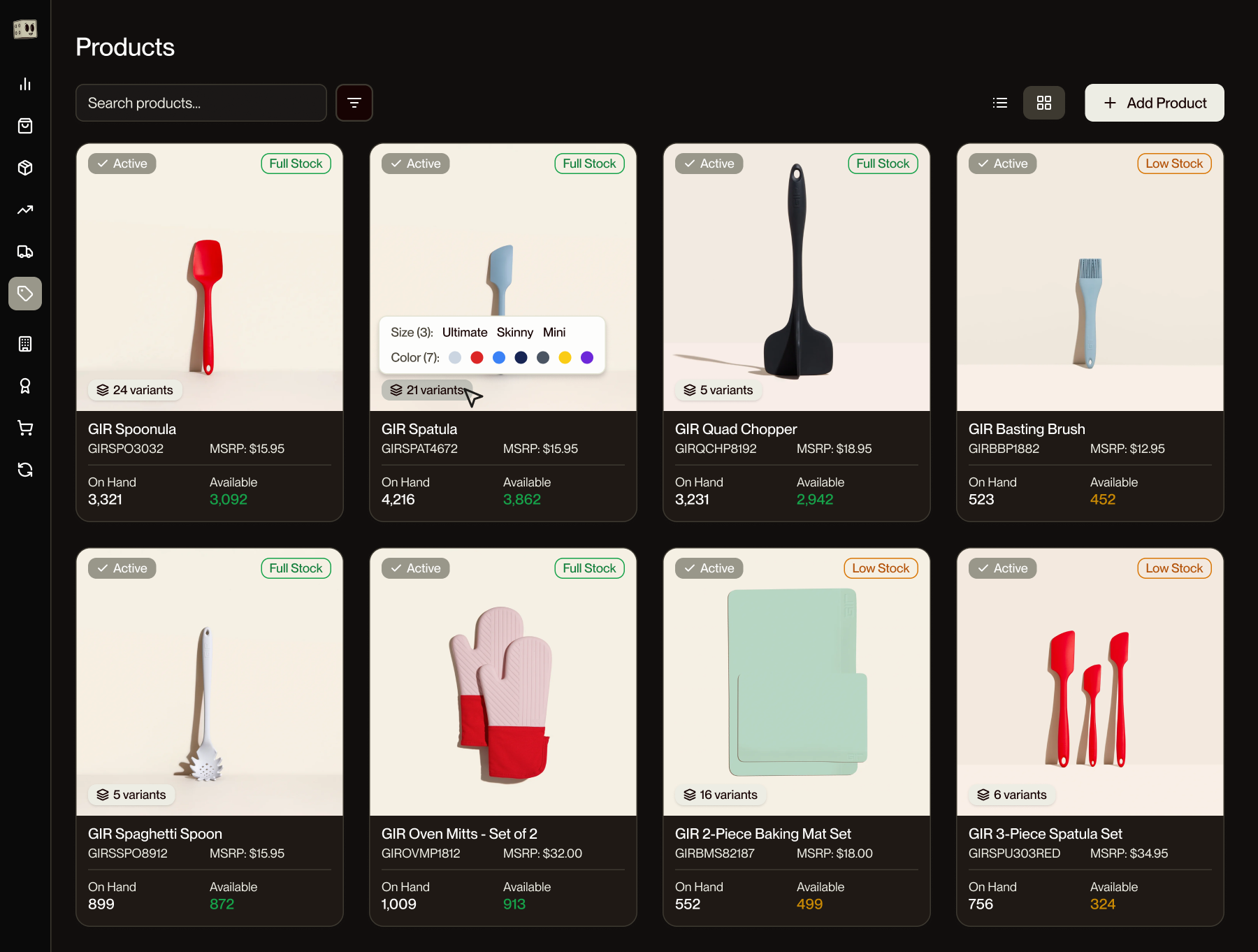
Grid View is the visual surface. Product cards laid out in a responsive grid, each one carrying primary image, title, status, stock level, and a fill-rate badge. Pattern-matched to Shopify so the mental model transfers instantly. Useful when you're scanning for missing imagery, checking which products are live and where, or just orienting yourself in a large catalog.
The two views toggle from the same toolbar position and preserve filters, sort, and selection. Mid-task view changes don't cost the operator their place.
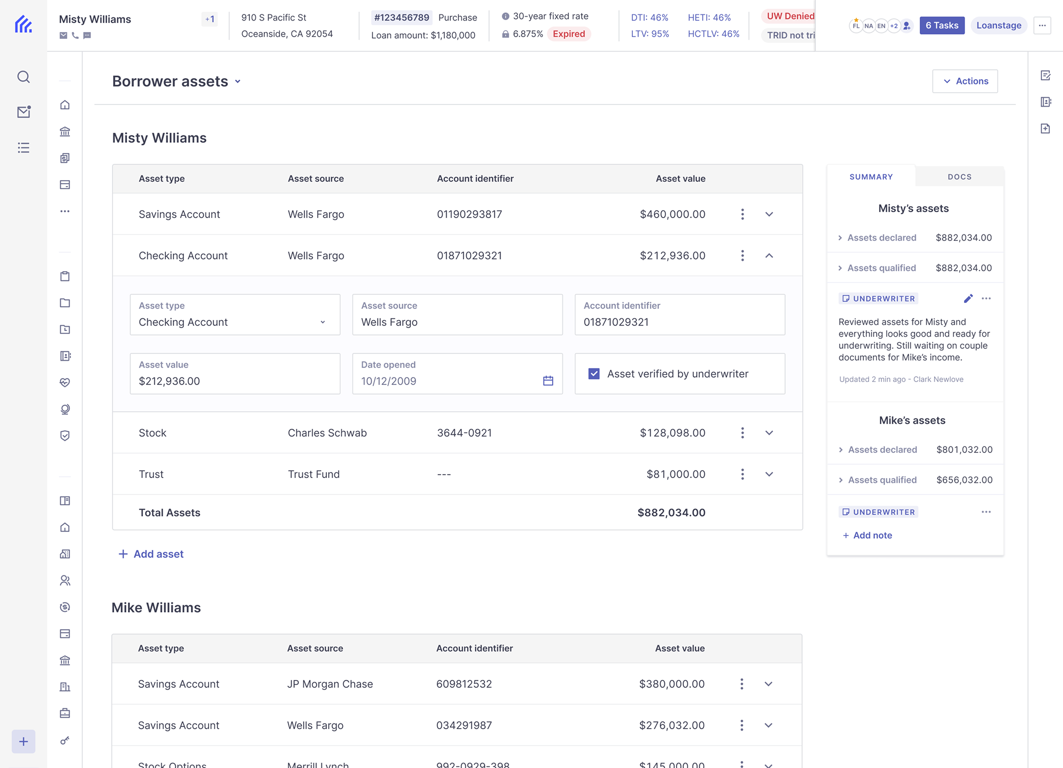
The Detail Page is for depth
The Product Detail Page is where a single product gets the full 200 dimensions of attention. Sheet View is breadth. Detail Page is depth.
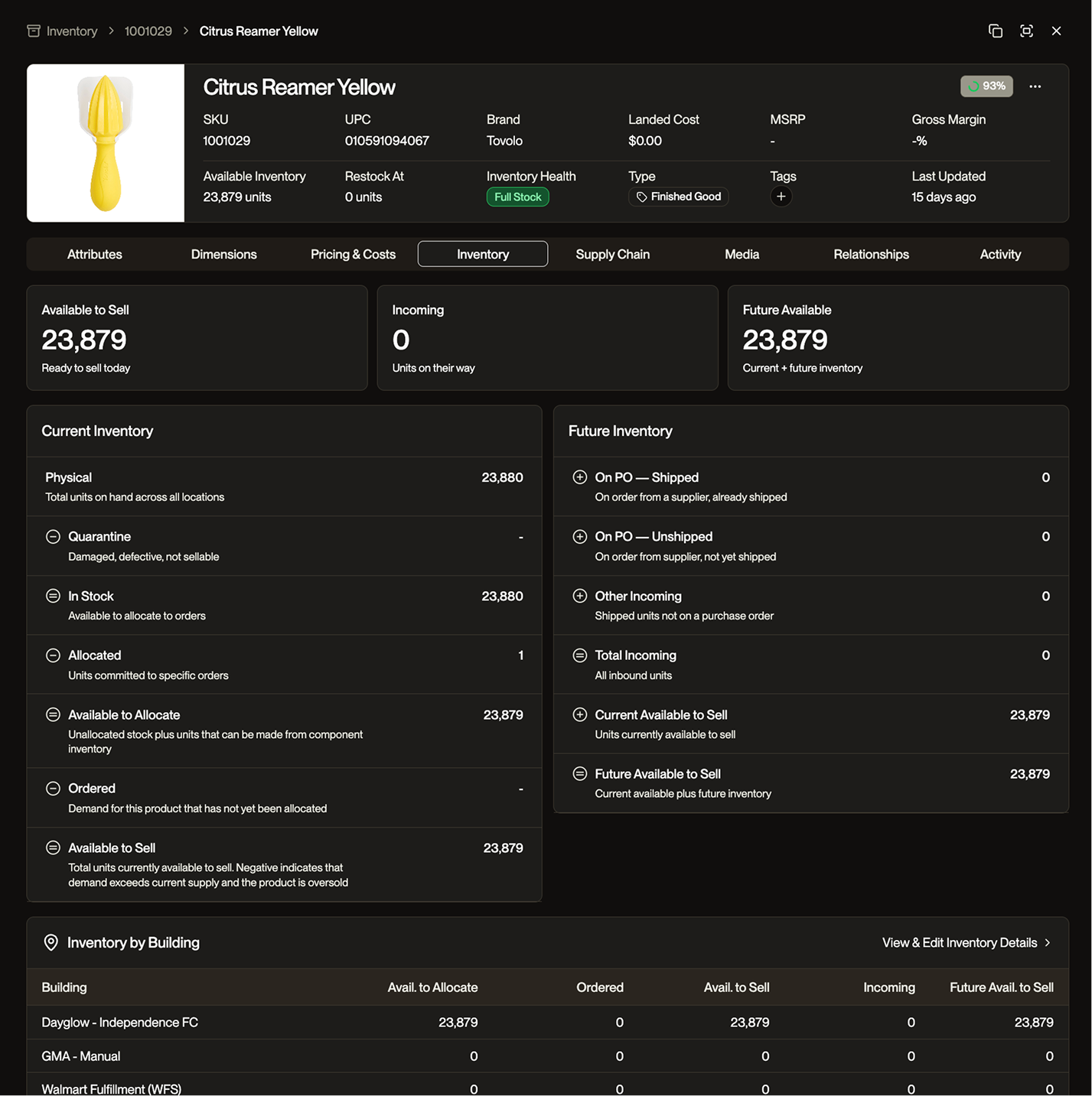
The page holds general info, attributes, pricing, inventory, supply chain data, and channel-specific fields without becoming a wall. Editing follows a different model than the sheet: a unified Edit Mode that flips the entire page into an editable state, with a single Save commit. The bulk surface auto-saves per cell because speed compounds across hundreds of edits. The detail page commits atomically because editing one product is a transaction; you want to review the whole record before saving.
Two surfaces, one mental model. Operators reach for the right tool without thinking about it.
Natural language as the third gear
I designed and built the Natural Language Editor on top of the catalog, end to end. Select 200 products, type Set MSRP to 4X landed cost and tag as Spring 2026, preview the diff, apply.
The decision worth flagging: I chose not to call the LLM. The parser uses schema-aware entity recognition against the product attribute namespace, resolves operations locally, and only escalates to a model when the prompt genuinely needs reasoning. Most edits resolve noticeably faster than an LLM round-trip, with zero token cost to the business. Knowing when an AI feature shouldn't be an AI feature is the decision that doesn't show up in a screenshot.
The same parser is the substrate for what comes next. Agents managing POs, shipments, inventory adjustments all need to translate intent into structured operations on entities the platform already knows about. Same parser, different caller. The product feature became platform infrastructure.
A catalog that holds 200+ dimensions of product data, three ways to edit that data, and one mental model. Sheet View for breadth. Detail Page for depth. Natural language for intent. The bulk layer is the foundation for agents.